请注意,本文编写于 231 天前,最后修改于 231 天前,其中某些信息可能已经过时。
目录
Scaffold 是 Flutter 中一个非常重要的 Material Design 布局结构组件,它提供了一个基本的页面框架,用于实现 Material Design 风格的页面布局。Scaffold 是一个 Widget,通常作为页面的根容器,用于组织和管理页面的各个部分,比如 AppBar、Body、FloatingActionButton、Drawer 等。
1. Scaffold 的主要作用
Scaffold 提供了一个标准的 Material Design 页面结构,包括以下常见的部分:
- AppBar:页面的顶部导航栏。
- Body:页面的主要内容区域。
- FloatingActionButton (FAB):悬浮按钮,通常用于主要操作。
- Drawer:侧边抽屉菜单。
- BottomNavigationBar:底部导航栏。
- SnackBar:底部弹出的轻量级提示。
2. Scaffold 的基本用法
以下是一个简单的 Scaffold 示例:
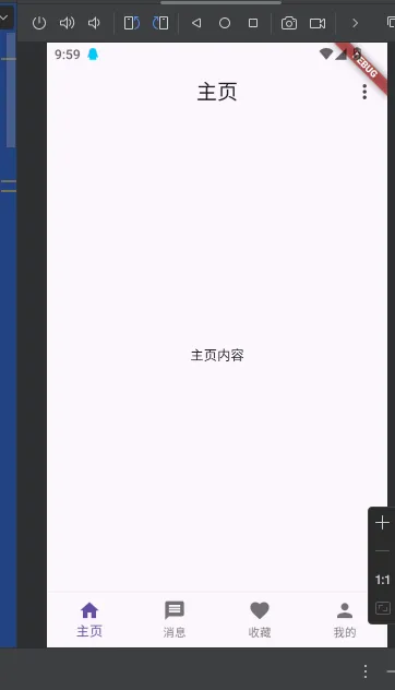
dartimport 'package:flutter/material.dart';

void main() {
  runApp(MyApp());
}

class MyApp extends StatelessWidget {
  @override
  Widget build(BuildContext context) {
    return MaterialApp(
      title: 'Flutter Demo',
      theme: ThemeData(
        primaryColor: Color(0xFF30DD81), // 设置主题色为 #30DD81
        primarySwatch: MaterialColor(
          0xFF30DD81,
          <int, Color>{
            50: Color(0xFFE8F8F0),
            100: Color(0xFFC6EED9),
            200: Color(0xFFA1E3C0),
            300: Color(0xFF7BD8A7),
            400: Color(0xFF5ECF94),
            500: Color(0xFF30DD81), // 主色调
            600: Color(0xFF2BD979),
            700: Color(0xFF24D46E),
            800: Color(0xFF1ECF64),
            900: Color(0xFF13C751),
          },
        ),
      ),
      home: HomePage(),
    );
  }
}

class HomePage extends StatefulWidget {
  @override
  _HomePageState createState() => _HomePageState();
}

class _HomePageState extends State<HomePage> {
  int _currentIndex = 0; // 当前选中的底部导航栏索引
  final List<String> _pageTitles = ['主页', '消息', '收藏', '我的']; // 页面标题

  // 底部导航栏的页面内容
  final List<Widget> _pages = [
    Center(child: Text('主页内容')),
    Center(child: Text('消息内容')),
    Center(child: Text('收藏内容')),
    Center(child: Text('我的内容')),
  ];

  @override
  Widget build(BuildContext context) {
    return Scaffold(
      appBar: AppBar(
        title: Text(_pageTitles[_currentIndex]), // 动态显示标题
        centerTitle: true, // 标题居中
        actions: [
          Builder(
            builder: (context) {
              return IconButton(
                icon: Icon(Icons.more_vert),
                onPressed: () {
                  Scaffold.of(context).openEndDrawer(); // 使用新的 context
                },
              );
            },
          ),
        ],
      ),
      body: _pages[_currentIndex], // 显示当前页面的内容
      endDrawer: Drawer(
        width: 200, // 设置侧边栏宽度为 250 逻辑像素
        child: ListView(
          padding: EdgeInsets.zero,
          children: [
            DrawerHeader(
              decoration: BoxDecoration(
                color: Color(0xFF30DD81), // 设置侧边栏头部颜色
              ),
              child: Text(
                '侧边栏',
                style: TextStyle(
                  color: Colors.white,
                  fontSize: 24,
                ),
              ),
            ),
            ListTile(
              title: Text('设置'),
              onTap: () {
                // 处理设置点击事件
                Navigator.pop(context); // 关闭侧边栏
              },
            ),
            ListTile(
              title: Text('关于'),
              onTap: () {
                // 处理关于点击事件
                Navigator.pop(context); // 关闭侧边栏
              },
            ),
          ],
        ),
      ),
      bottomNavigationBar: BottomNavigationBar(
        currentIndex: _currentIndex, // 当前选中的索引
        onTap: (index) {
          setState(() {
            _currentIndex = index; // 更新选中的索引
          });
        },
        type: BottomNavigationBarType.fixed, // 固定样式
        items: [
          BottomNavigationBarItem(
            icon: Icon(Icons.home),
            label: '主页',
          ),
          BottomNavigationBarItem(
            icon: Icon(Icons.message),
            label: '消息',
          ),
          BottomNavigationBarItem(
            icon: Icon(Icons.favorite),
            label: '收藏',
          ),
          BottomNavigationBarItem(
            icon: Icon(Icons.person),
            label: '我的',
          ),
        ],
      ),
    );
  }
}
3. Scaffold 的主要属性
| 属性 | 说明 |
|---|---|
appBar | 页面的顶部导航栏,通常是一个 AppBar 组件。 |
body | 页面的主要内容区域,通常是一个 Widget(如 Container、ListView 等)。 |
floatingActionButton | 悬浮按钮,通常是一个 FloatingActionButton 组件。 |
drawer | 侧边抽屉菜单,通常是一个 Drawer 组件。 |
endDrawer | 右侧抽屉菜单,通常是一个 Drawer 组件。 |
bottomNavigationBar | 底部导航栏,通常是一个 BottomNavigationBar 组件。 |
backgroundColor | 页面的背景颜色。 |
resizeToAvoidBottomInset | 是否调整页面内容以避免被键盘遮挡,默认为 true。 |
4. Scaffold 的常见使用场景
- 标准页面布局:用于实现 Material Design 风格的页面布局。
- 抽屉菜单:通过
drawer属性实现侧边菜单。 - 悬浮按钮:通过
floatingActionButton实现主要操作的按钮。 - 底部导航栏:通过
bottomNavigationBar实现底部导航。
5. Scaffold 的嵌套使用
Scaffold 可以嵌套使用,但通常情况下,一个页面只需要一个 Scaffold。如果需要在一个页面中使用多个 Scaffold,可以通过 Navigator 或 TabBar 实现。
6. Scaffold 的生命周期
Scaffold 本身没有生命周期方法,但它可以与其他组件(如 StatefulWidget)结合使用,实现页面的生命周期管理。
本文作者:yowayimono
本文链接:
版权声明:本博客所有文章除特别声明外,均采用 BY-NC-SA 许可协议。转载请注明出处!
目录